Fever Charts Explained
A fever chart can be thought of as health report of a project's current state and it's past progress.
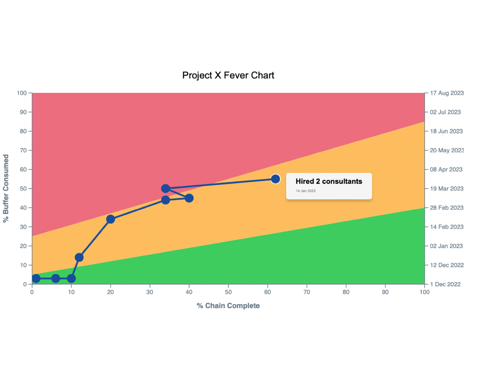
In simple terms, it's a plot of the buffer consumption against the total completion of the project.
The “fever chart” term is closely related to the Critical Chain Project Management from the Theory of Constraints. According to which, buffer shouldn't
be allocated to tasks individually, but added at the end of the project to ensure its successful completion.
What We Offer
Automatic calculations
Based on the best case task duration and the worst case durations you entered in our network editor, Energer automatically calculates all your project buffers and total critical path (or chain) durations and uses this for the baseline view. You can also set default worst case multipliers in the project settings allowing you to customize how buffers are calculated.
Plot snapshots
You can plot your snapshots onto the fever chart over time, giving you a visual representation of your project's progress. This is a great way to track how well your project is staying on schedule, and they are dynamic so you always know the information behind each snapshot. With individual tasks not buffered, and buffer managed at the project level allowing better utilization of resources, improving communication and coordination. This reduces the risk of task delays impacting the overall project timeline.
Easy to use
Our fever chart tool is user-friendly and intuitive, with a simple interface that makes it easy to input data and generate the chart. Plus, it's integrated with our other project tools, so you can generate these charts with a single button click. The fever chart is fully customizable allowing you full control on what you see as green/yellow or red zones.
Fast Results and easy to understand
Gain insights, look at the plot on the right (or play around with an actual chart at the bottom of the page) for a demo fever chart. This single page visual is a great story of how the project is progressing and if any corrective actions are needed.
How does it work?
Create your schedule
Create your schedule and sync it to generate the initial baseline.
Take a fever chart snapshot
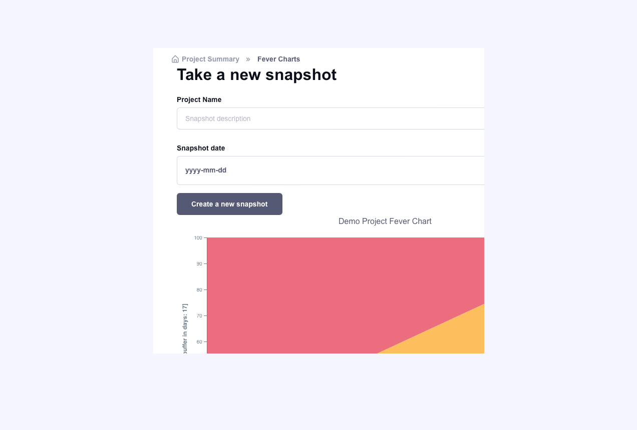
On the fever charts page, enter a description and pick a date (or use todays); this will generate the fever chart information by calculating how much of your project is complete and how much buffer was used.
Take Fever charts regularly
When you make changes to your schedule, take a fever chart snapshot, this allows you to visualize how your project is trending and helps you understand remaining work and buffers and allows you to visualize your projected end dates.
Simple Fever Charts.
Fever charts are an effective way to track the progress of a project and ensure that it stays on schedule. By comparing the percentage of critical chain completed against the buffer consumed, project managers can quickly identify if the project is on track, behind schedule, or ahead of schedule. This allows for early detection of potential issues and adjustments to be made in order to keep the project on track.
What are Fever Charts for project schedules?
A fever chart, also known as a performance measurement baseline chart, is a graphical representation of a project's performance over time. It shows the current completion of the entire projection, plotted against the total buffer used to date, and it's an essential tool for project managers to monitor and track the progress of their projects and make corrective action if the trend lines don't look great.
- Provides a simple visual representation of project progress over time.
- Helps identify potential project delays or areas of risk.
- Allows for quick identification of trends in project performance.