Fever charts
Energer's Fever Charts offer a dynamic visual representation, tracking the relationship between critical path completion and buffer consumption, providing a powerful tool for proactive project monitoring.
Need help?
Just contact us via the contact form below and we'll be happy to assist you.
How Can I Visualize Project Health Over Time?
Understanding Fever Charts
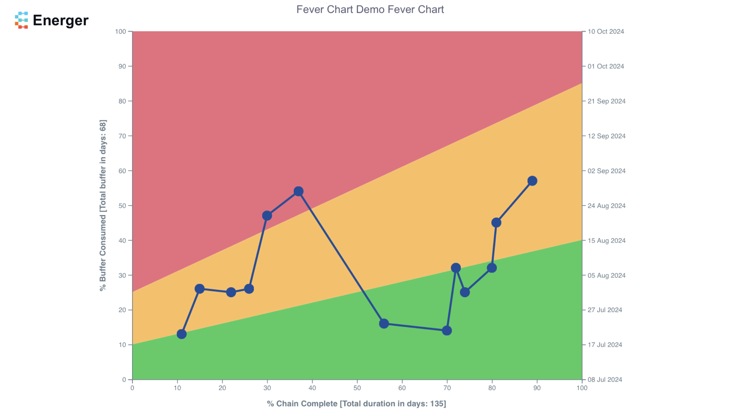
A fever chart is a visual gauge of how your project is doing; it shows what percentage of your project is complete and how much of your project buffer has been used so far.
In the Critical Chain project methodology, buffers are strategically placed at the end of the project rather than being allocated to individual tasks. Energer uses your best case and worse case (or project defaults if you don't specify it) durations to calculate project buffers. This happens the first time you schedule (by clicking update) your project network.
The X-axis on the fever chart represents the percentage of your project that is complete (critical path or critical chain). The Y-axis shows the percentage of your total buffer that is consumed. This buffer, in terms of a schedule translates into projected project completion dates (that are shown on the right side).
Over time, as the project progresses, tasks are completed and buffer consumed; the fever chart shows a visual representation of this journey and the relationship between these two over the course of the project.
In a perfect world, where all your tasks were completed exactly on time (based on the best case duration) the fever chart line would be a straight line on the X-axis as zero buffer is consumed. Alternatively, if most of the buffer of the project is consumed and only a portion of the tasks are completed, the fever chart will show points near the top (red zone), which, if extrapolated would show that its likely that your project will go beyond the original projected complete dates.
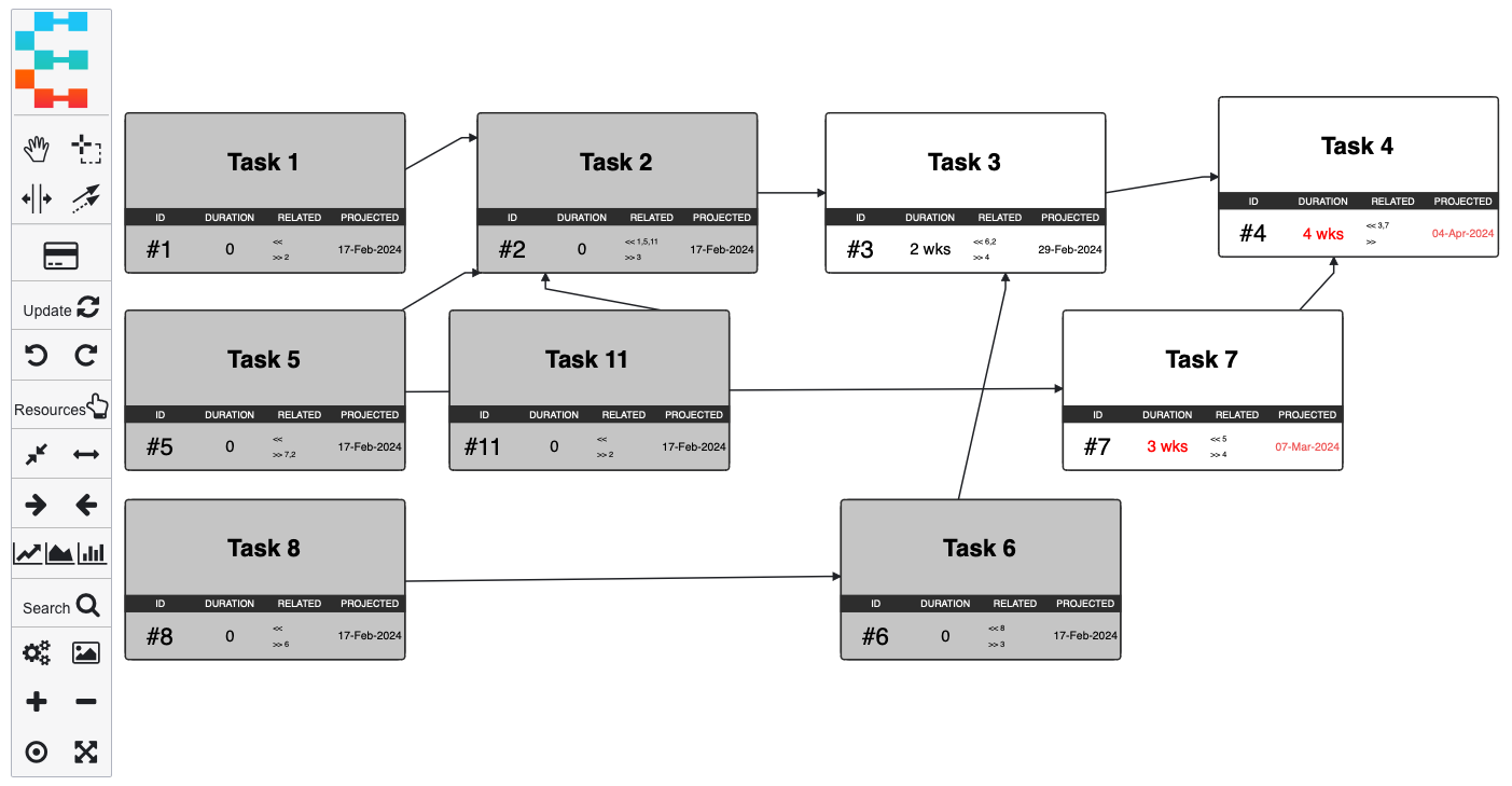
Create your network diagram
As described in the network editor tutorial, create your project schedule; add tasks, their durations, and dependencies. If there are worst case durations for tasks, you can enter those by right clicking or double clicking any task. If left as-is at their defaults; Energer uses the project default multipliers to calculate worst case durations.
Once your network is complete, click on the 'Update' icon; this will schedule the project (determine the projected completion dates) and since it's the first time you are running the project update; it'll create a baseline of your project.
In this step, Energer calculates all your project buffers, buffered completion date etc. It uses the duration settings for best case and worst case, as indicated for your tasks.
As project buffers are based on this initial critical path duration, if there's a significant change in your project (such as adding a large number of new tasks, or significantly changing the dependencies of tasks) you might want to consider resetting this baseline (to calculate new buffers), this can be done in the project settings page by clicking Reset Project Baseline.
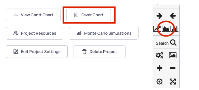
Access the Fever Chart
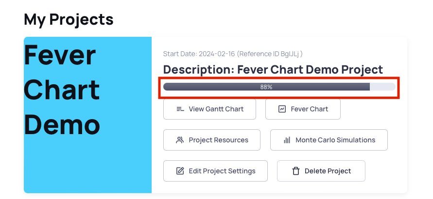
Navigate to the Fever chart Dashboard by clicking the Fever Chart icon on the network editor or the Fever Chart button on the Project Dashboard as shown in the image here.
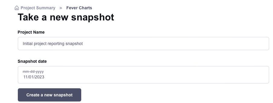
Let's create our first Fever Chart snapshot
Initially the Fever Chart plot is empty, this is because we have not yet taken snapshots that show up here.
To take a Fever Chart snapshot, simply add a description on the form shown, pick the appropriate date and click on the 'Create a new snapshot' button.
The date you pick here matters. On the network editor, all duration listed for current tasks is assumed to be 'remaining' days for the task to complete. As an example, say a Task has a duration of 2 weeks and there are no predecessors (or all its predecessor tasks completed).
This indicates that this Task is going to take 2 weeks from today to complete. However, if you had updated the network editor last week and have not made changes to account for the progress of the task until today, using today's date for snapshots will cause more buffer to be consumed. Because, as indicated, this task still needs 2 weeks to complete from 'todays' snapshot date.
To account for this, Energer allows you to specify snapshot dates. This date should reflect when the task durations were updated. Generally the date you pick is today's date as that's when you updated the network editor to reflect the latest tasks completion and remaining durations. However, as mentioned above, if you updated the project network on a different day compared to when you are taking fever chart snapshots, you will have to pick the appropriate date to account for the most accurate reflection of buffer consumption and progress.
Review the first fever chart update
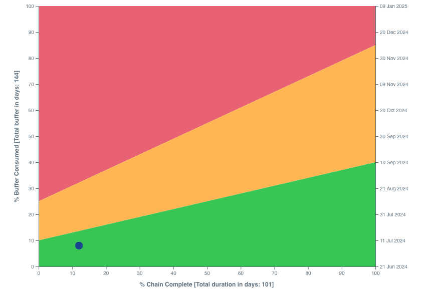
The first update you'll see a single point plotted, this represents the amount of progress your project has made (the X axis is total completion), and how much buffer is consumed (the Y axis is buffer % used).
In this example, we can see that we've completed roughly 12% of the project while consuming 8% of the buffer. Based on our current graph settings, this shows up on the green zone (the zones are fully customizable as we'll see later) .
Also note on the fever chart, that it shows the total duration of the project on the X axis and the calculated total project buffer on the Y axis.
Make few more updates
On a frequent basis, update your project schedule by updating tasks on the network editor. This is done by either marking them as complete (setting duration as 0) or reducing the remaining time a task now needs to complete.
You can also add new tasks, resources, or update relationships as appropriate. The network editor being the source for all project information should be kept up to date as all Energer's features (including the Fever Charts) consume information from the network editor data.
Create snapshots regularly
Each time you make changes to the network editor, you can come to the fever chart page and take new snapshots.
You can also align with Fever Chart Dashboard reporting frequency with your organizations reporting cadences. This could be weekly, bi-weekly, or monthly.
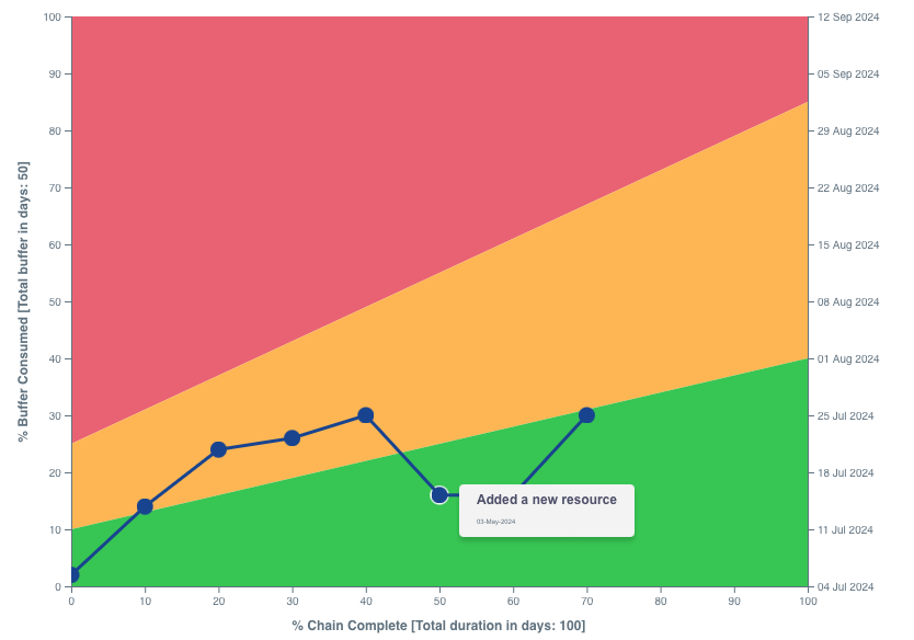
As you can add descriptions along with your Fever Chart snapshots, hovering over the chart will show your the date of the snapshot and the description. Allowing you to glance over the key activities during that time period.
Review your project completion
The Project Dashboard also provides a simple visual of the total percentage of your project that's complete.
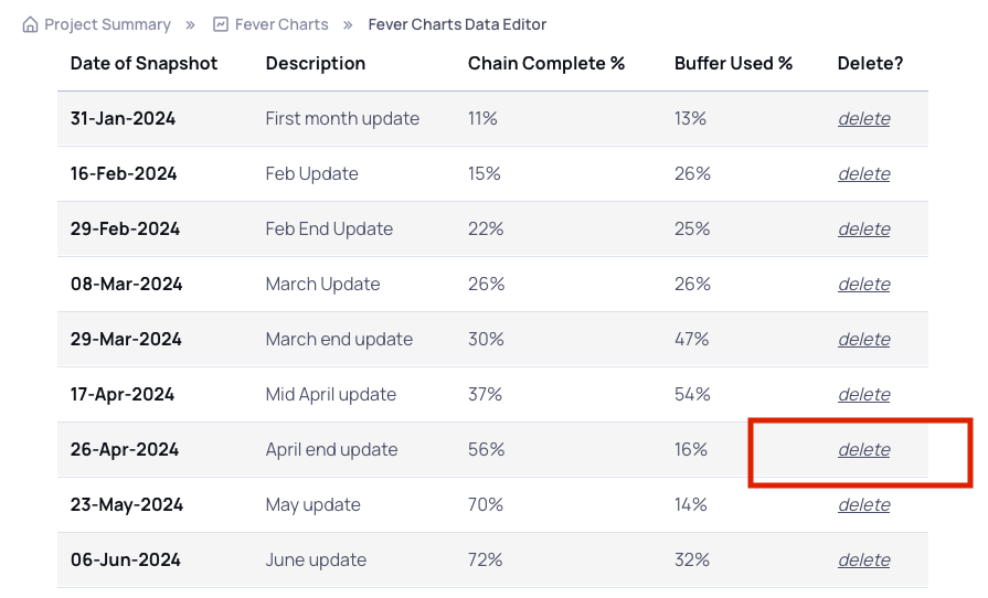
Delete an incorrect snapshot
If a Fever Chart snapshot is incorrect or you do not want to include a certain update on the Fever chart, you can click on the "Edit Fever Chart Data" from the Fever Chart Dashboard page and click 'delete' for any entries you want to delete.
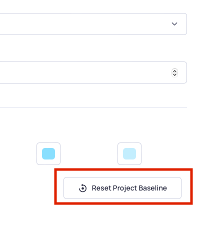
Reset the project baseline
You may consider resetting a project baseline when faced with significant changes such as a substantial addition of tasks, complexity alterations in dependency logic, or modifications in project scope. Resetting ensures accurate buffer calculations and provides a fresh start, particularly beneficial when the project undergoes substantial structural adjustments.
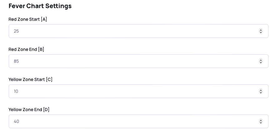
Change the Fever Chart red, yellow, and green zones
The Fever Chart zones—red, yellow, and green—indicate project health based on buffer consumption. To adjust these zones, navigate to the Project Settings page, locate the A, B, C, D values, and modify them accordingly. Lowering or raising these values allows customization of the zones, enabling users to align the Fever Chart with specific project management preferences and thresholds.
Note: Adjusting the Fever Chart zones via the Project Settings only impacts the visual appearance and does not alter the calculation of buffers or project completion. It's crucial to recognize that these settings serve as a visual indicator. Additionally, organizations might implement communication protocols, such as notifying project sponsors or executives, based on predefined thresholds, such as entering the red zone. Always consider and adhere to the communication plan and project governance rules established by your organization.


Frequently Asked Questions
It is advisable to create Fever Chart snapshots regularly, particularly after implementing updates to the project schedule. This ensures a consistent and up-to-date reflection of your project's progress. Additionally, consider creating snapshots when reaching project milestones, encountering significant events, or as part of routine project monitoring to maintain accurate and timely insights into your project's health.
Yes, you have the flexibility to customize the risk zones on the Fever Chart. Navigate to the Project Settings page and adjust the A, B, C, D values to modify the green, yellow, and red zones according to your project management preferences. This customization allows you to align the Fever Chart with specific thresholds tailored to your project's unique characteristics and objectives.
You can adjust where you want the Red Zone to start and end, you can also specify the same for the Yellow zone; the remaining area on the plot being green. Feel free to modify these values to achieve an optimal fit.
When creating snapshots, consider selecting relevant dates that align with key project milestones, major updates, or critical events. For accurate representation, use today's date for current progress or choose a specific past date if you've updated your schedule in the past. This ensures snapshots provide a meaningful and contextually accurate reflection of your project's status.
The Fever Chart serves as a visual tool that aids decision-making by offering an intuitive representation of your project's health over time. It allows you to quickly identify trends, potential risks, and the trajectory of your project, empowering you to make informed decisions, take proactive measures, and optimize your project management strategy for successful outcomes.
Extending the trend line towards the right side of the plot provides a predictive insight into potential project completion times. This projection is based on the observed trend in critical path completion and buffer consumption. By visually extrapolating the trend, project managers can anticipate the likely timeframe for project delivery, aiding in proactive planning and strategic decision-making. It's a valuable feature for assessing the project's overall trajectory and establishing realistic expectations for stakeholders.
This projection is crucial for proactive planning and aligning stakeholder expectations. Additionally, it's essential to be aware of organizational rules regarding communication when the project is in certain zones. Many organizations implement protocols, such as informing project sponsors or executives, when the project enters or trends towards the red zone along with possible mitigations for a successful timely completion of the project.The Fever Chart is a relationship between how much of your project is complete (compared to the baseline plan) and how much buffer is consumed (based on the original critical task's durations).
It is quite possible, that new tasks were added that extended the critical path (or chain); and thus the progress indicator on the fever chart showed a lower percent completion (line going backwards).
As an example, say your project has 10 sequential tasks, each taking 10 days (best case). This project has a total duration of 100 days. Lets assume that each of these tasks had a worst case duration of 15 days.
In this case, the total project buffer would be 50 days. Lets say, 5 of the tasks were completed and each task took 12 days each. When you take a fever chart snapshot in this instance, you'll see a point at the 50% completion on the X axis (as 50 days of work was completed compared to the 100 day original plan) and the Y axis being at 20% (2 days extra each for 5 tasks is 10 days which is 20% of the 50 day buffer).
Now lets imagine you realize we need to add additional 3 tasks to the schedule (say 10 days each too). Once added, if you take another fever chart snapshot; your total project is 130 days long (100 from the original and 30 days added for the new tasks). Here since only 5 tasks (50 days) were completed out of the total 130 day project. your % completion on the X axis will show ~38%. This is an example of how the fever chart lines can go backwards.
In the same way, if buffer consumed or tasks completed are way beyond what was planned during the initial project snapshot, the fever chart lines can go outside the bounds of the graph. In these cases, either corrective action is needed to bring the project back on track, or a re-baseline or reset would be recommended.
The buffers in your project are calculated based on the difference between the best case and worst case durations of tasks. For instance, if a task has a best-case duration of 10 days and a worst-case duration of 13 days, the buffer for that task would be 3 days. If the worst case is not specified, the project default multiplier is used to estimate the worst case. For example, if the default multiplier is 1.5, and the best-case duration is 10 days, the estimated worst case would be 15 days (10 days * 1.5). This method ensures a dynamic buffer calculation, reflecting the variability and uncertainties associated with each task in your project.
Note: If you adjust the project default multipliers after the project has been "synced" and has an established baseline buffer and end date, modifying these settings won't retroactively affect those existing buffers. To apply the updated settings to calculate buffers with the new multipliers, click the "Reset Project Baseline" button found at the bottom of the Edit Project Settings page. Keep in mind that this action will reset all progress calculations, and new buffers will be recalculated based on the modified settings.